Pages

Friday, October 24, 2014

Blog post #6

Untitled
Unknown artist, unknown date
Photography
In Untitled, we see use of the four topics we learned about today: foreground/middleground/background, overlapping, relative size, and linear perspective. The foreground in this photo is most likely the shadows of the people and the rocks and trails on the ground. The middleground is the building and tree next to it, and the background is the small-looking building and trees behind the ones in the middleground. For overlapping, there is a tree blocking a majority of the building's roof, and what seems like a bush is on top of the left part of the ground. For relative size, there are many trees, presumably the same size. One of the trees is next to the building, but most of the trees are in the background. The most linear perspective we can see is the shadows of the people, starting narrow up top and gradually growing as it nears the bottom of the photograph, to two vanishing points on a horizon we can't see. This picture is incredibly mysterious because the title, artist, date it was taken, and place it was taken is all unknown. The only thing known about this photograph, taken directly from the Museum of Modern Art website, is that it was submitted to the MoMA by Jeffery Fraenkel, an author and photographer. "Gift of Jeffrey Fraenkel" is the only information available, which makes this photograph evoke a few questions: Who took this photo? Who are the shadows of? Where are they and what are they doing there?


Perspective drawing
My bedroom door
Techniques shown: Foreground/Middleground/Background, overlapping, linear perspective

Blog Post #4


I chose this drawing from the Museum of Modern Art, it was made by William Kentridge in 2002, and the medium used was Charcoal on paper. This piece of art is called Drawing from Zeno Writing. It is a 2D Drawing. In this art work the artist didn’t use any color. What we can see is that the artist used different tone of shadings one of them are soft and others are heavier to make emphasis on the important things. For example we can see that the shadings in the sky are soft and smooth meanwhile the shadings on the four men that are on the middle are heavier. The artist also used different kind of lines for example we can see Horizontal lines vertical lines and curve lines.  This artwork is monochromatic because it shows many variations and shading of the same color that in this case is black. I think the focal point of this drawing is the statue that is in the middle. I believe that this artwork shows asymmetry balance because if you were to fold this art in half the only thing that would remain the same is the men on the horse that is on the top of the statue the rest would be different. It is interesting see how the artist played with lines and shades to create this piece of art.  After having my first class of drawing now I find easy to draw anything because now I know that just starting with lines we can create wonderful drawings.

Blog Post # 3


This collage image was designed by Eduardo Paolozzi, it was made in 1967. It was cut- and pasted printed paper and pencil on graph paper. This is a 2 D collage which counts with a variety of color. As we can see it counts with primaries colors such the red, blue and yellow that are the most vivid colors that we can appreciate in this collage. As we can realize, we can apply the rule of Thirds on the three cartoons that are on the top.  For me there doesn’t seem to be a focal point in this collage, the attention of this piece is all around causing the eye to move across the art work. I could also argue that there are many parts where we can appreciate unity. For example, the way that the artist arranged the pieces and the colors in the cartoons could be one, and also the way the he arranged the color in those little squares. This collage also has repetition or pattern because it has a repeated design. This is an interesting collage because it seems that the artist  took his time to create this wonderful collage   if we analyze it deeply we are going to realize that it also has variety  because it provides similarity and contrast to attract the viewer’s attention. It is interesting that we can say that this work art hast two visual weight elements and those are symmetric and asymmetric because if we fold it in almost half of the collage is going to look the same but the rest that are those little boxes with different colors are going look different because they don’t have the same design nor the same colors.

Thursday, October 23, 2014

Blog Post #5

The Musicians: Michelangelo Merisi


The is a 2D painting that I chose for this homework assignment which I found on the Metropolitan  Museum of Art website. This painting is called "The Musicians" painted on 1595 by Michelangelo Merisi and is made with oil on canvas. While viewing this artwork, I notice the styles of this painting and the aspects of this work that makes the people in the painting. First I see that it's a naturalistic painting meaning that it has a representational style to it. All the characters in the painting looks realisic and I can actually see what the painting really is and Im able to identify the figures in it. Also the people in this piece of work aren't one hundred percent perfect. In each you can see their features and flaws within their body and clothing. Not only this but it is a painting that involves human form like the position of each person and the objects they are holding are all real things. On the other hand, this painting symbolizes unity because the artist created this painting so that everything in it would fit together to make one whole. It also has a feeling or emotion to it meaning that all four people have a relationship with one another, since it looks like a visual of a musical practice session. Their faces all have different face expressions which shows that each of them have their own feeling to what is hppening at the moment. After viewing this painting it made me realize that art can look more realistic than you think because when you learn the meaning of art and how it works your able to pull every detail representing a specific thing or story.

Blog Post # 5

 
I chose this Painting from  the Museum of Modern Art. This painting is untilled; it is Synthetic polymer paint on canvas. It was painted by Henry Taylor on 2011. This is a 2D painting. This painting is a representational style of art because by seeing the painting you can say exactly what it is. We can also say that it is realistic because it makes actual reference to human form. This painting has many details that a human being has for example the necklace that is hanging over his neck, his skin’s color. This painting could represent any person. The way that he is holding his hands makes the painting look even real, because those details make a big emphasis on the way that human being acts or the style that they have. This art work shows some of the design principles for example, the emphasis that is where we as viewers will center more attention and the focal point that in this case is the men sitting. It is where one's attention is directed once we look at the painting. The artist also played with the negative and the positive space. The positive space in this case is where the man is sitting the rest that is in gray and that is behind him is negative space. This painting also includes geographic shapes for example circles is his head and in his necklace a triangle in his hands, and square in his legs. The balance in this painting is symmetrical because if we fold this painting both sides are going to look like the same.
 

Hw #5


I found this painting on the Metropolitan Museum website. This is painting made out of oil on canvas by Pablo Picasso. The title of this painting is called Head of a Woman. When looking at this painting you can see where the face of the woman is but it isn't realistic or doesn't resemble a head of a woman. The style of this piece is abstract, this piece clearly plays with the form of a woman's head. It plays with the form by using different colors and shapes. First thing that came to my attention was the color Picasso used as the skin to make the skin of the women's head. The color seems to be tertiary colors of a blue and purple mixed together. The face of the woman is also uneven as one side is longer than the other side. Also the eyes aren't the same shape, one eye resembles a rhombus. The eyes are also not even, the right eye is lower then the left eye. Picasso uses organic and geometric shapes to play with the head and face of the woman. The ears aren't in place as one is right next to the eye and the other is apart from the other eye. The nose seems to be on the right side of her face as it rests on her left side. Picasso using a large range and making the painting almost non recognizable, he exaggerated the features on the woman's face and played with it.

Blog Post #5


This piece is called "Estudiante Muerto" by Alejandro Obregon and it is located in the Art Museum of the Americas. Right off the bat, you can somewhat see a person and as you look more into it, you can tell that this person is laying on top of a table with various objects around he or her. The style Obregon chose to use in this painting is very unique, in the sense that the title and what's in the work are hard to correlate to. The title translates into "dead student" and looking at the this for long won't make you see anything close to that. Obviously this is an abstract piece for many reasons. We can tell that the shapes he used as well as the colors are all over the place. This gives this painting a look that seems to have been distorted. Aside from the human body, the animals and items around him are all presented in the same fashion. Everything is mainly the color red but some things are a blue color, making this even more abstract. The figure of the body is stylized because it's just a human body. There are no real specific human features that could distinct this from anyone else drawn at this level. I think the artist chose to style this painting like this to signify how the meaning of the youth dying. I believe that the chicken and the rose like object signifies labor while the bottle and wine glass represent having a bitter sweet feeling. These things are sometimes hard to grasp, explaining the abstract nature of this piece.

Blog Post 5


Mother and Child by a Fountain

Hello there fellow bloggers!
This week I will be discussing the Oil on Canvas above, “Mother and Child by a Fountain”, painted by Pablo Picasso in 1901. I was on a seemingly endless search for just the right piece until I came across this work. It spoke to me right through the computer monitor. I have gone back and forth regarding the style, but I would consider “Mother and Child…” to be a slightly abstracted painting, while also possessing an idealized quality. I understand that the work is not representational, but I believe this is Picasso’s vision for the “ideal” mother. The baby has no face, which tells me that he/she is not a very important element of the piece, but rather a prop for the focal point.
Picasso, in my opinion, has a theme of maternity throughout the painting. The work is almost entirely monochromatic, but the color blue that he chooses, I believe, is very significant. The fact that the mother is standing next to a fountain, with flowing blue water, tells me that the artist sees these elements as symbols for life. And we all know that without water, there can be no life. I love the way Picasso uses extra large brush strokes for the piece, which help create organic shapes. One last thing I want to speak about is the loving attentiveness of the mother. She has both hands, firmly securing the baby, and is clearly kissing the child. I think that the artist is letting us know that this is a wonderful and caring mother. She takes maternity very seriously. The work makes me think about my own mother, and I especially wonder if “Mother and Child..” was created in Picasso’s mother’s image.

Blog post#5

              
Art- style with depicting the human figure

The name of this drawing is “The Dancer (1946)”; the artist’s name is Max Weber. The medium of the drawing is Pastel on brown, moderately thick, rough-textured laid paper. I found it from the Brooklyn museum link. The style of the drawing is abstract. In first look it seems like there are no connection between the real world and the art work. Here the artist followed the abstract or Picasso method. This is an example of opposite of a realistic artwork. The artist simplified a figure of a dancer. He only kept the important elements of a dancer and ignored everything else. Without looking at the clue of the title, it’s hard to figure out the subject of the drawing. After observing deeply, I can say that it is a drawing of a lady dancer. He just drew a straight line in the left hand side from the chest to the feet of the women and one curve in the right from wrist of an upward hand to other feet. Then he made a kind of connection between two lines in the bottom part of the drawing and shaped women’s lags. Furthermore, to represent the hands he drew two more small curves. The women’s head is not really recognizable, but we can guess. May be, the twist or crook line represents the woman’s hair. In addition, it is not a drawing of any specific dancer. It works as an example a model of a dancer. It could be any dancer. It is so general, so simple. The artist played with lines and made a very meaningful stricture. 


“ Hans Tietze and Erica Tietze- Conrat” by Oskar Kokochka is the work of art that I chose for this weeks blog post. I found this artwork in the Museum of Modern Art’s website, it is an oil painting on a canvas that was made in 1909. The styles of art in this painting is identifiable because I can tell what the work of art is, it is a woman and a man who appear to be about to hold on to each others hands. It is also representational and realistic because the artist makes reference to the human form. I think that the artist chose to make this art work in this style because he wanted to show and tell his viewers that the couple both seem sad and tired and the background of this painting I think the artist was trying to show the darkness blurriness of their future, it also shows the couple about to hold hands which seen to represent that although life isnt good now they will always stand beside one another. This artwork shows some of the design principles for example the emphasis and focal point of this painting is the couples hands because it is where one's attention is directed once we look at the painting, Also the background of this painting shows variety because many different colors are used and it looks like the artist also used many paint strokes in order to show the unclearness and sadness of the couple.  He also used warm colors that are associated with sun, heat and fire.


Blog #5


This painting is  called Street Scene (Hester Street). The artist is George Benjamin Luks and its was painted in 1905. The style of this painting is both representational and abstract.The artist clearly defines certain parts of the painting where you can clearly see the people and structures and he also adds a certain blurriness to other parts of the painting. You can clearly see the people in the front and the children gathered around in the street. You can also see the structure of the buildings and its windows in the background on the left side of the painting. These make the painting representational along with the way that you can see some of the peoples faces. The fact that you can see faces makes some of the figures realistic. The stylized part of the painting would be the people who's back are turned or the ones whose face you cannot see. In the background on the right hand side you can see some blurry characters and you can't really tell if those are people in the street or just some kind structure. Another part that you can kind of see but not really tell exactly what it is, is the blue flowers basket in the lower right hand part of the painting. You can tell that these are flowers but can't exactly tell what kind of flowers these are. These parts of the painting would what make it abstract. The artist probably chose this style of painting to make it look complex. He wanted it to be unique in its own way. It tells the viewers of the painting what exactly is happening in a majority of the painting but not exactly what everything is in the peoples surroundings.

Post #5

Brian DeGraw. 4:18 am. (2003)
This is a felt-tip pen and ballpoint pen drawing done by Brian DeGraw in 2003.  This is pretty 

Peter Doig. Study for Lapeyrouse Wall. 2003
This is an oil painting done on paper by Peter Doig in 2003 called "Study for Lapeyrouse Wall."  The figure in it is slightly abstracted but not so much that you can hardly tell what it is.  It is clearly a man holding an umbrella and walking away from the viewer.  The feet seem much to large for the rest of the figure and the legs seem to be bent a little bit in a weird way.  A major clue to show that the painting is stylized it that the figure's face isn't shown.  He's walking away and his head is even obscured by the shadow from the umbrella.  There is a basic sense of what is going on in the painting but there doesn't seem to be any great effort to put a lot of detail into the work.  There is an almost perfect symmetry even though for some reason it feels heavier on the right side to me.  That is most likely because he is facing and walking in that direction.  But the figure is pretty much right in the center of the painting and the umbrella is pretty much directly on top of the figure's head.  The background is pretty even from on side to the other although there are some weird splotches about 1/3 of the way up the painting and I'm not sure if they were intended to be something and I just don't see it or if it's just how things came out or maybe they were intentional but not really meant to be anything. Overall I think this a good work.  It is stylized and abstracted just enough so the lack of detail doesn't seem like poor skill and it isn't boring to look at. 


hw5


It took me a while to find a painting but I finally found one as you could see. I found this piece of drawing in museum of art. This piece of art looks like a drawing to me I could be wrong cause I feel like it's a painting but for now it’s a drawing to me. In this drawing you could see there's a lot going on there's lines going everywhere, in a way you could see shapes well one shape which is a circle you could see them a couple of time in this drawing. Right off the bat you could tell this is not a representation because in this drawing you can't really tell what it is. And this drawing is not a non representational because it don't contain no formal reference to natural world. When you look at this drawing you just have to stare at it for a while because its so interesting make you question why the artist did all of this. The artist chose to make the work in this style because I feel that the artist want you to question this drawing in a good way, want you to look at it and try to figure what's going on. I always like looking at drawing and painting that have this kind of of style in them. I like to figure out what's going on in the drawing. Art don’t have to always be about drawing or painting a shape or a person but it have to be about making your art different, creative, unique making it catch other people eyes .

Blog Post#5


This painting I have collected from Brooklyn Museum link. It is a European art “Portrait of Jean de Carondelet” (1469–1545) by Jan Cornelisz Vermeyen. The style of this art is representational or objective. This art depicts the physical appearance of reality. As representational style has two categories realistic and naturalistic I think this one is naturalistic. It looks real but slight altered, it is nearly photographic but not totally that’s why I think it is naturalistic. The artist was more concerned about the method rather than content. If it were realistic then the artist would pay more attention about whom or what he is painting but as it is naturalistic the artist has paid more attention on how this art is being painted. He paid more attention about how to make this Pearson’s appearance more natural or spontaneous. I can see naturalism through the staring eyes, high cheekbones, broad nose, and dour mouth of the person of this painting. The artist also carefully drew the texture of this person’s white hair. I think he chose to make the style of this art in naturalistic way to show the reality of material world. He wanted to show a natural life but with little interpretations. As we can see the way he drew the hands or gesture of that person shows more detailed. Therefore with details he increased the accuracy of the painting. Moreover,this painting implies a lot about this person who is drawn. The way artist drew him or chose the background using cool color implying that person’s mood or character. The postures of his both hands are making him both enigmatic and imperious.


Wednesday, October 22, 2014

Blog #5


I got this medium off The Metropolitan museum from Georges Braque The Studio ( Vase before a window) 1882-1963, Paris. This oil painting is form of geometric, therefore the image in the painting are not realistic and are distorted. Looking at the painting we can see some items in the image that is obvious to our eyes of what the item can be such as the chairs, tables, windows and sky, but the whole painting overall we can really see it clearly in a realistic view because that's not how those things really look in real life. I believe the reason why the artist Georges Braque reason for choosing to create this painting the way he did was so we can see the world in a different way more like a fun way than realistic and obvious. I believe he probably wanted us to be able to move our eyes around and try make us see differently like the way he does. By us looking at this painting we can see that Georges Braque is very creative with the way he chosed to paint the geometric shapes and distortion apart from how the image would really look in real life. He also uses vibrate colors to create his piece which makes the items in the painting pop out more. When we take a look at this painting we can see he used rhythm on the sides of the painting with the repetition of the yellow colors on the right and the blues on the left.


Blog #5


Head of a Woman (Portrait of the Artist's Mother)

Juan Gris
(Spanish, Madrid 1887–1927 Boulogne-sur-Seine)
http://www.metmuseum.org/exhibitions/view?oid=490615


The picture I chose is from the met museum link titled "Head of a woman" by Juan Gris. The medium used to create this piece was oil on canvas, created in 1912. While searching for an image to use for this post I was looking for something a little out of my comfort zone, something I wouldn't normally choose. This painting managed to capture my attention, its simple yet complex at the same time with a representational style. The style of this painting is abstract as well, it is purposefully distorted and very simplified. The way this painting is viewed as abstract is the way the artist plays with the shapes and its form that alter the way a real face should resemble. It is very clear to see a human face in this piece with out reading the title. It is also clear to see that this human figure is a woman with the indication of the earrings. These figures also make this painting stylized, this face could be any person. The artist used monochromatic colors of gray and some blue keeping it within the cool colors. I love the way the artist gave this piece a visual rhythm in the use of the shapes and twisting the face.

Blog #5

blog 6

WATER MIDDLe
                                BY  PAULO MONTEIRO 
2011


           I choose this art from Museum of modern art and it is a drawing and i think there is lots of style in this drawing, i can clearly tell that it is not representational because i can't tell what exactly it is, but it seems like a huge lake for me, so that means it is slightty abstract i can't say it's a lake because it is non representational or nonobjective because there is no any formal reference to the natural world. But at same time it looks like realistic because even though it didn't shows any specific objective i can feel that it can reference to middle of the ocean on hot day with clear blue sky. i can see some form of ship or boat in this art. The style of this art is representational and idealized because it set as a society belief, ideology, perfection what lake or ocean should look like. In this art all I can see is cool color sky blue and it's reflection in the water. By looking at this picture I can feel relax and peace, and Monteiro is playing with color and it alter the real one. The texture of this art is smooth and there is no any forms and features in this art which clearly shows the object but we can say its water and sky blue so I think it mostly slightly abstract and both representational and abstract can interpret in this art both are present. It is very simplified art but it tells a lot more than what I can see.

Tuesday, October 21, 2014

Museum Essay


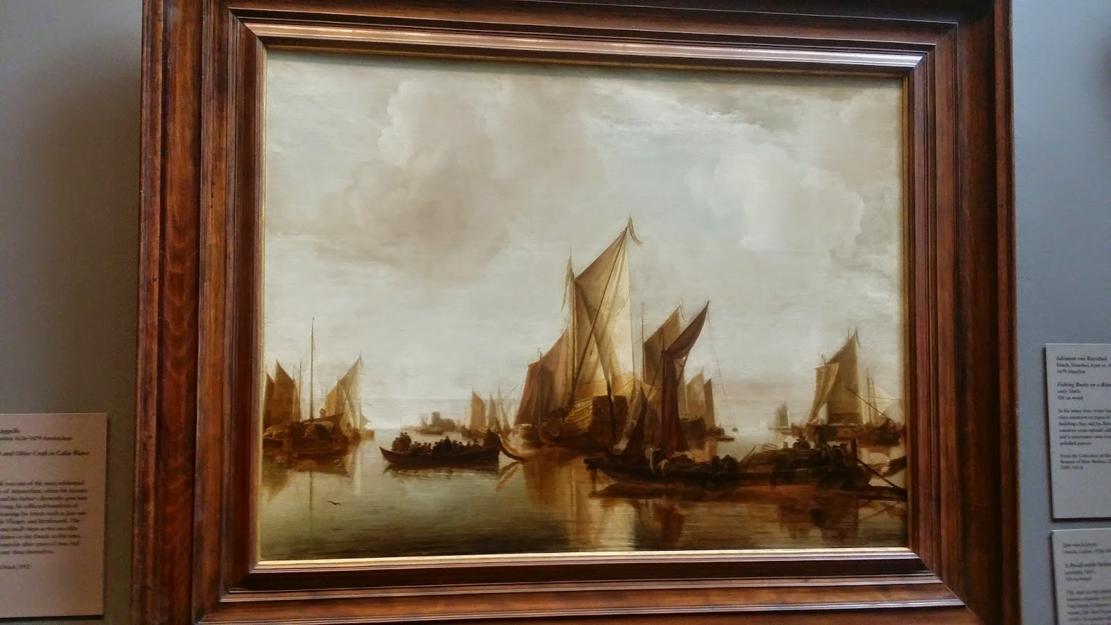
             The first painting is called A State Yacht and Other Craft in Calm Water. This work was created by Jan van de Cappelle in 1660. This is one of Van de Capelles oil paintings. The actual texture of this is smooth.  The second painting is called Wheat Field with Cypress. This work was created by Vincent van Gogh in 1889. This just like the first painting is an oil painting.
             Unlike the first painting though this ones actual texture is not smooth, instead it is rough due to the way the artist painted it. Another difference between the two is the coloring that is used. The first painting has very little primary colors while the second painting has more primary colors such as blue for the sky. They both also has cool colors used for the water and the sky. The first picture has a lot of negative space due to the use of white for the sky. The second picture has less empty space due the way it was painted. The clouds are more defined and visible in the second painting.
             The first painting has plenty of lines in it. You can see the lines mainly used in the sails of the boats. Most of the lines are vertical but not all of them are straight. The second painting really doesn't  have any lines in it. Both of these paintings have different types of shapes in them. The first painting has geometric shapes and inorganic shapes in it. The organic shapes would be the clouds and the people on the boats. The geometric shapes would be the sails of the boat. Many of them are a rectangular type shape. The difference in the second painting is that it has no geometric shapes in it. It does have organic shapes which would be the clouds, the trees, the grass, and the wheat field.
             Both of these paintings captured my attention in different ways. The first painting was very calm and very soothing to look at. On the other hand the second painting I found seemed to jump right out at me with its bright colors and differential style of how it was painted. Both are great pieces of art from two different centuries and are unique in their own way.

Museum Essay #1


    The trip to the Metropolitan Museum of Art was a great experience for me. This was my first time in this kind of museum since I came to this country. From other classes that I had taken, I had heard about this museum but didn't any idea of how it looked in the inside and the place where it was located. This museum has sculptures and paintings that are from many years ago which surprised me when I saw them and even more when I saw the date when they were done. In this museum, once I was inside every painting and sculpture caught my attention because of the big collection that they have but as the assignment says we were supposed to choose two paintings or two sculptures to compare them. From many options that I had, I decided to pick this to paintings right on top. The one on the left side has the title of "Madonna and Child with Saint Francis" made by Giulio Cesare Procaccini, in Italian, Bologna 1574-1625 and is an oil on canvas. The other on the right side, has the title "The Coronation of the Virgin" made by Annibale Carracci in Italian, Bologna 1560-1609 Rome also painted in oil on canvas.

     This two paintings in my opinion are good for this assignment. This two paintings have similarities that can be compared looking at them side by side. Both of this paintings have principles of design. What I notice at first, is the contrast that exist in. By describing where contrast is shown in this two paintings, I can say that the contrast that I see on the painting on the left side is between the red cloth that the lady who is carrying the child has on and the blue that one of the children that is hidden behind the man on the left side. On this painting I also see smooth shading and the different tone of shadings that is all over the painting that makes it have that realism. On this painting, another principle of design that I can notice is repetition. The person who made this painting used repetition on the shape that he used to make every person's head on this painting. About this painting I can say that the focal point is the lady and the child because is where all the people on this painting is looking at them. In addition, another principle of design is balance. On this painting there is an asymmetrical balance.

    In comparison to the painting on the left side, the painting on the right side is almost similar. Some of the similarities are the quantity of people that are in the painting. In terms of principal of design, I can tell that there is an asymmetrical balance in this painting. I say this because if I cut the painting in two halves, the amount of objects and people are the same, the shapes are different. As we see on the left side painting, this painting also has smooth shading that brings the painting to life. In both paintings, light is implied. Another similarity that the painting on the right side has is contrast. The contrast between colors is the same as the painting on the left side red and blue but in a different  place. In my opinion, what make this two paintings similar is where the viewer focus their eyes. For me on this painting my eyes were focused on the middle where the virgin is which was the same case as the painting on the left.
      

Monday, October 20, 2014

Museum Essay


Throughout mankind’s history there have been countless battles between countries and lands. To the victors of such conflicts go the spoils of war, prestige being one undeniable benefit. For centuries now, artists have strived to capture the emotions of war. With the invention of the camera, at the turn of the century, these struggles have been primarily documented by way of the photograph. While a beautiful medium in its own right, the photo unfortunately tends to have limitations. I would say it is representational art in its purest form, and gives the artist little freedom. That is why in this essay I will discuss two works of art, that were painted several centuries apart, depicting scenes from a time of war. Since both were created well before the invention of the camera, we can see the liberties that the artists take in each painting.  

The first piece I chose is a battle scene painted on the exterior of an Egyptian pharaoh’s tomb. The work was done on sandstone, sometime between 1479-1400 BC. It shows Syrian soldiers being trampled under the horses that pull the royal chariot. The painting depicts the decisive victory for the pharaoh and his army. In order to showcase the military might of Egypt, the Syrian soldiers appear confused and discombobulated. There is a definite balance when you scan the piece, and although the soldiers are frozen in a state of chaos, I feel a certain rhythm as I view from left to right. Afterwards, my eyes get pulled to the soldier in the lower left of the painting. Although it’s unclear if it was indeed the artist’s intention for him to be the focal point of the piece, the man’s light skin contributes a small variety to the work. The sandstone’s natural hue is utilized as negative space between the fighters.

For my second choice, we must fast-forward to 1851, where we have an absolutely breathtaking oil on canvas by German-American artist Emanuel Leutze.  The piece is tremendous in size, and is called “Washington Crossing the Delaware”. Being somewhat of an American History lover myself, I simply could not pass up the opportunity to write about a painting that depicts such an important moment in the Revolutionary War. Carried out on December 25th, 1776, the surprise attack that follows Washington’s daring voyage across the partially frozen river, was undoubtedly a major turning point in the war for our freedom. The subject matter is American patriotism, with a special emphasis on Washington, the war hero and eventual president. The colors utilized are mostly dark tones, which makes sense due to the early morning hour, but the artist shines bright and beautiful light around G.W., especially in his face. I believe the colors are supposed to symbolize hope. Hope in the war effort, and hope for America. There is great depth in the work, and you can see many small boats filled with troops for the invasion in the distance. While standing in front of the painting, it seems as if everyone in G.W.’s boat is to my proportion in size. Possibly my favorite aspect of the entire painting is the American flag. The reds and blues that the artist use for the flag are incredibly vibrant, and give an overall sense of unity to the piece.  

Both of these paintings have similar subject matter, but the Egyptian artist chose to focus on the destruction of the pharaoh's enemy, while Emanuel Leutze preferred to glorify Washington and his military intelligence and foresight. Leutze uses colors to illustrate mood, while the earlier work is much more monochromatic. After doing this assignment, I found it amazing how similar subject matter can be for two pieces that were created thousands of years apart from each other. I thoroughly enjoyed our trip to the Met, and in fact, made a return trip on Sunday afternoon to catch another glimpse of these two amazing paintings.