Showing posts with label Andrew. Show all posts
Friday, December 12, 2014
Ripples in the Tides
For this exhibit I would put it at the poolside cafe. The reason I would put the exhibit here is one because of the name and its association with water. Since my exhibit has to do with the water it seems like the perfect place for it. The second reason for choosing the poolside cafe is that its big and spacious. It has enough space to accommodate all of these pieces of art. The third reason I chose the poolside cafe is because that it is always crowded. This area always seems to be packed with people, more so than the other buildings.
The theme of the show has to do with the water. As the title seems to imply it has to do with ripples in the tides of the water. I came up with the ideas after I picked the venue. I figured it went hand in hand. Poolside cafe with the word pool in it and it's location near the pool has do to with water. When I think of water I think of the ocean, a river, lake, pond, or pool and all of these things are somewhat soothing and relaxing. Whether you are on a boat sailing, swimming in the water, or just simply relaxing and listening to water move or flow. As for how I came up with the main title of the exhibit, the paintings that seem to entice me the most are those of the ocean. I just find them interesting to look at especially the detail in which they are painted and I also find them soothing to just look at. This show is important because of the potential it has to draw an audience. If these pictures are in fact soothing then if students are having a somewhat stressful day they can simply come and check out the exhibit and it would help them relax a bit.
As curator of the show I picked the pieces because they all have to do with the theme of the show. The first painting is called Estaury at Day's End and it was painted by Simon de Vleiger in 1640. This painting captures the everyday life along the Dutch coast at the time. In the picture you can see the boats sailing along the coast. The one boat is sitting at the dock while two people are applying tar to it. You can also see black smoke from the fire that is heating up the tar rising up towards the clouds. The second painting is named Seaport with the Embarkation of Saint Ursula and it was painted by Claude in 1641. According to legend, St. Ursula made a voyage to Rome accompanied by 11,000 virgins and returned with them to Cologne where they were all martyred. In the painting you can see the girls carrying bows and arrows, symbols of their martyrdom. The building on the left is based on the Tempietto di San Pietro in Montorio, Rome. The canvas was painted in 1641 for Fausto Poli, who was made a cardinal by Pope Urban VIII in 1643. Onece again you can see the tide in the water and the ripples.
The third painting is named the Red Rigi and it was created by J.M.W. Turner in 1842. The painting was created with watercolor, wash and gouache with some scratching out. In this painting you can see people in a small boat in the front. In the background you see another boat with one person in it. This painting is attracting by the light watercolors that were used. If you look at it you can almost envision a peaceful day out on the lake. The water seems calm with not too much of a strong tide and the ripples can be seen from the boat moving. The fourth picture is named Morlaix, Entrance of the River and it was painted by Paul Signac in 1927. It was created using black crayon and water colors. This painting is very different from the others in the way it was painted and the detail that the artist put into this work. It show one boat in the water with the ripples and tides going towards what looks like an island in the middle of the river. Just by looking at this picture you seem to get lost in it's details and color. The fifth and last painting is named Green Line with Green Eyes and it was painted by David Reeb in 1952. This is an acrylic on canvas painting. I picked this painting because it just seemed to jump out at me and it also seem a little random. In this painting, the Green Line passes between a tranquil and hedonistic world, represented by the hotels along the Tel Aviv beach, and a world suffused with fear and violence, represented by the masked Arab youth and the two (human or animal) figures standing behind him. The Green Line both unites and separates the two decorative patterns in the painting: the x pattern that appears against a pale blue sky, and the eyes blazing against an intensely colored red ground. The hotels and the Arab youth are copied in a similar manner from photographs, and are depicted in black and white. They create a uniform, non-hierarchical visual continuum, analogous to random channel surfing on TV or to flipping through
newspapers that depict harsh scenes from the Israeli-Palestinian conflict and neutral scenes from everyday life alongside each other. The emphasis on eyes as a recurring motif in this by Reeb is intended to rehabilitate a communal, collective form of vision. I found that this painting with all it's detail told the most intriguing story out of all of the other paintings. It also stays in the concept of the exhibit with the hotels overlooking the ocean with the ripples and tides.
Monday, December 8, 2014
Blog #8
I went to the Museum of Modern Art for my trip, The reason I picked this museum is because I have never been there before. The first picture is a picture I took of the museum right outside the cafe area. I took a picture of the paintings that I most found interesting and stood out to me. The second picture is a painting called the Song of Love. The artist is Giorgio de Chirico and it was painted in 1914. This painting is one of the artists most famous works. In this painting you can see obvious shapes such as the green circle. The part that stood out to me the most was the sculpted head with the glove right next to it. The sculpted head was painted with much detail as you can see the ridges in the hair.
The third picture is called The Menaced Assassin. This was painted in the year 1927 and was created by the artist Rene Magritte. This painting intrigued me by the story it had to tell. It shows a man next to a gramophone in the same area as a nude woman. On the outskirts of the picture it shows two men as if they are prepared to attack him. Also if you look closely enough you can see three men in a picture behind them. The negative space which is the white walls in the pictures really helps bring out the rest of the details.
The fourth picture is called I and the Village. This painting was created in 1911 by the artist Marc Chagall. I found this punting interesting because of all of the detail in it and the colors used. It seems like it's a persons head and a horses head that are close together. The person's head seems to be green for some reason also. Then in one of the small triangles of he painting you can see a person with a scythe walking towards a woman laying on the floor. Inside of the horses head you can also see a cow painted with a person milking it. The painting overall has great detail and tells a story in itself which I found to be extremely interesting.
The fifth picture I took was called The Sleeping Gypsy. This was painted by the artist Henri Roousseau in 1897. The reason I liked the painting is because of the simplicity of it. The picture itself seems to depict a lion standing over a sleeping women in the desert on a moonlit night. The one thing that stands out to me the most is the woman's colored garbs. It's a rainbow colored dress garment. The other thing that stood out was the lions mane. The artist made sure it stood out by the ridges in it so you could tell what animal it was.
All in all the trip was good. I got to see many of todays modern works. The museum itself was nicely built and warm. It was open till 5:30 pm because it was a Sunday. The admission was also free as long as you showed your student I.D. which i found was pretty cool. Not a lot of museums do these kind of promotions anymore. It was also a little more crowded than I expected on a Sunday but mainly with tourists not too much with native New Yorkers. I saw many pieces of interesting artwork and I hope to go back one day when they add new pieces to their collection.
Friday, November 21, 2014
Essay #2
The class trip to the Chelsea galleries was an interesting one. I got to see different artists and their works. The pictures that I have posted here are the few that I liked the most and found intriguing. The first two pictures are from the artist Takashi Murakami. His exhibit was called "In the Land of the Dead, Stepping on the Tail of a Rainbow." The first picture captured my attention because it captured expression with the words death, hate, and I. Then the background consisted of different color skulls which was pretty cool. I like the fact that he linked the word death with the skulls in this picture. The second one interested me just because I found it odd. There are two creatures heads in the center of the painting and in the lower creatures heads there seem to be other beings inside of its mouth. The light blue background also makes the picture kind of pop and captures your attention.
The third picture is from the Francesco Clemente "Two Tents" exhibit. This was just basically two tents that were painted inside and out with great detail. The outside of the tent is pretty much just a pattern painting and then the inside has a lot more detail to it. The fourth painting come from the Arturo Herrera exhibit. This painting seems to be a painting of colors within a painting. The outer layer is the brownish white and the inner layer has the green, red, yellow, and blue color. I couldn't figure out if the paining has a deeper meaning to it or if it's simply what is painted there. The fifth painting is from the Anton Kern gallery. I really like how this painting was done. It has a nice blue background that captures your attention and the bright orange lines just seem to pop out right at you. These lines are all connected together and at the end of each of them was a different picture of something whether it was a car, field, or lady which i found interesting. The sixth picture is from the Chamber of Fine Art gallery. Now this painting is a painting that looked like it took a while to paint just because of the detail and all the different colors used all over it. It is basically a head of a wolf painted on some kind of designed paper that almost looks like ones of those plastic table cloths. The last picture comes the David Zwirner exhibit. This painting i found odd as well as the rest of them. All of his paintings seem to have people in then that are part animal or some kind of monster. They either have wings or claws on them. In this picture it seems like a women is coming out of the sea creature that is cut open and laying on the ground. These works of art seem to be more unique and different than the artist of older times. These painting use a lot more bright colors and a lot of them are more random than the basic paintings of that are more common in the older generations. These do seem more relevant to our world because it shows that you express yourself anyway that you want. They strife for their art to be different. That's what makes it unique and captures the attentions of others. The one that really seemed like a lot of handwork was put into it was the two tents exhibit. Just the fact that the outside and the inside of it were both painted fully and with great detail showed how much effort and dedication the artist put into this work. That's the one I was most impressed by and I appreciated the most.
Friday, November 14, 2014
Thursday, November 6, 2014
Midterm
The artist I was assigned to talk about is Catherine Opie. Catherine Opie is an american artist. Her work is based on documentary photography. She was born in 1961 in Sandusky, Ohio and then later on moved to California when she was a teenager. Catherine talks about how she was only interested in the architecture of American cities. She would "empty" out these cities and just take photographs of building and structures by itself. You would not see any people or animals inside of these portraits. After she started to photograph in the streets again though, she explains how she was brought back to the roots go street photography. She also talks about seducing the viewer in a different way to pictures besides just relying on the body and color. She realized that it was time to stop emptying out cities and start documenting notions in time. Notions of American landscape in terms of identity. Catherine tells about how she photographed Lake Eerie in Ohio but one of the things she did not like was the waves. There are photographs that she takes of the same thing but just in different seasons. One of her photographs she talked about is one that was going to to be placed in a hospital. She wanted it to be just right, to be life changing whether you were in the hospital receiving good news or bad news. I found what she said next extremely interesting. She said wanted people to look at her picture and for it to make them feel like an escape for them. This was how she got through hard and emotional time during her life. As you can see in the above photographs the first one could be considered an empty portrait because all it is, is a mountain, trees, and water. The second photograph though is more when she changed her view and started photographing notions in time. This photograph was from the Inaugural series in 2009. When choosing her photographs she lines then all up on the wall so she can compare them and see which aspects she likes from them the most. She explains that it's more than just getting a nice shot of something that makes a picture good. The light and image needs to be balanced to really have a portrait. You can see the people standing up watching the screen to see the president. This is capturing a specific moment in time. The materials she basically uses is her camera and paper she prints the pictures on. I think that her work is successful and complete exploration in her ideas. You can tell by her photography, it speaks for itself. She captures a time and events in some of here photographs such as the Inaugural photograph and then captures a soothing more comforting photo where you can envision yourself in such as the mouton picture or the picture of the man with the surfboard at the beach. This video definitely made me think differently about the way artists work. It made me think about what exactly the artist is trying to explain or what the reason is for creating that piece of art they made. What story is it trying to tell? Why did they pick this specific thing? Is the art supposed to have a deeper meaning? Is it supposed to be soothing and provide a way of escape like some of Catherine's works do? These are all questions that I will ask myself now when looking art different types of art. The only thing I did find surprising is the pictures of the emptied out cities. I found it surprising because sometimes pictures like that can be bland or boring but the pictures that Catherine took gave you a look at the architecture and the emphasis that was put in to build certain buildings. Along with that it also left me with a sense of intrigue. It had me wonder about what was actually happening at that place in that specific time that the picture was taken. There are no people in the pictures to help suggest what's taking place, you are only left with your mind to help you imagine what could be taking place in that city in the photo.
Friday, October 31, 2014
Blog Post #6
The first painting is found at the Metropolitan Museum of Art. The name of it is The Manuscript Leaf with the Presentation in the Temple, from a Book of Hours. The artist is Alice M. Dike and it was painted in 1927. The foreground can be the green tile in the front, the middle ground can be the people and the table, and finally the background can be the colorful diamond like designed screening in the back. There is definitely overlapping when it comes to this picture. You can see how the people overlap some of the other people and you can also see how the people overlap the table.You can see the depth of the picture from the table in the middle. The picture was painted at eye level. In my drawing a drew a storage room that I have in my house. This was drawn from eye level. In the storage room is a small table on the left hand side, a longer bench like table in the middle, and a small toy chest on the right hand side. In the back is the wall that houses one big window.
Thursday, October 23, 2014
Blog #5
This painting is called Street Scene (Hester Street). The artist is George Benjamin Luks and its was painted in 1905. The style of this painting is both representational and abstract.The artist clearly defines certain parts of the painting where you can clearly see the people and structures and he also adds a certain blurriness to other parts of the painting. You can clearly see the people in the front and the children gathered around in the street. You can also see the structure of the buildings and its windows in the background on the left side of the painting. These make the painting representational along with the way that you can see some of the peoples faces. The fact that you can see faces makes some of the figures realistic. The stylized part of the painting would be the people who's back are turned or the ones whose face you cannot see. In the background on the right hand side you can see some blurry characters and you can't really tell if those are people in the street or just some kind structure. Another part that you can kind of see but not really tell exactly what it is, is the blue flowers basket in the lower right hand part of the painting. You can tell that these are flowers but can't exactly tell what kind of flowers these are. These parts of the painting would what make it abstract. The artist probably chose this style of painting to make it look complex. He wanted it to be unique in its own way. It tells the viewers of the painting what exactly is happening in a majority of the painting but not exactly what everything is in the peoples surroundings.
Tuesday, October 21, 2014
Museum Essay
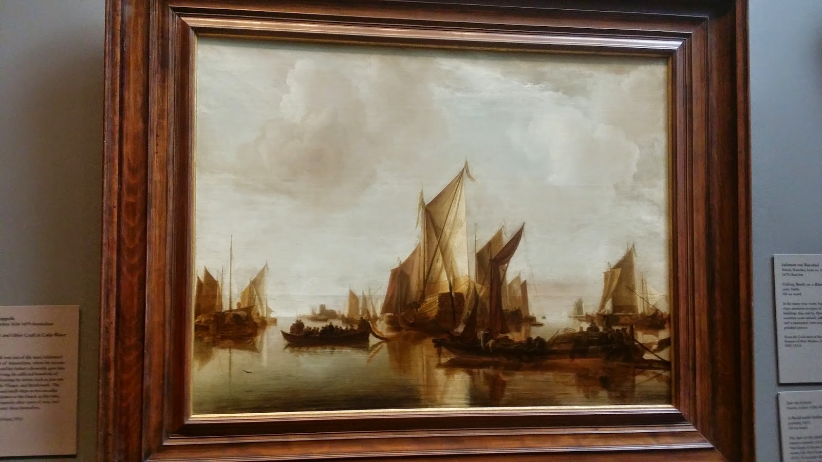
The first painting is called A State Yacht and Other Craft in Calm Water. This work was created by Jan van de Cappelle in 1660. This is one of Van de Capelles oil paintings. The actual texture of this is smooth. The second painting is called Wheat Field with Cypress. This work was created by Vincent van Gogh in 1889. This just like the first painting is an oil painting.
Unlike the first painting though this ones actual texture is not smooth, instead it is rough due to the way the artist painted it. Another difference between the two is the coloring that is used. The first painting has very little primary colors while the second painting has more primary colors such as blue for the sky. They both also has cool colors used for the water and the sky. The first picture has a lot of negative space due to the use of white for the sky. The second picture has less empty space due the way it was painted. The clouds are more defined and visible in the second painting.
The first painting has plenty of lines in it. You can see the lines mainly used in the sails of the boats. Most of the lines are vertical but not all of them are straight. The second painting really doesn't have any lines in it. Both of these paintings have different types of shapes in them. The first painting has geometric shapes and inorganic shapes in it. The organic shapes would be the clouds and the people on the boats. The geometric shapes would be the sails of the boat. Many of them are a rectangular type shape. The difference in the second painting is that it has no geometric shapes in it. It does have organic shapes which would be the clouds, the trees, the grass, and the wheat field.
Both of these paintings captured my attention in different ways. The first painting was very calm and very soothing to look at. On the other hand the second painting I found seemed to jump right out at me with its bright colors and differential style of how it was painted. Both are great pieces of art from two different centuries and are unique in their own way.
Thursday, September 18, 2014
hw #2
This first piece of accidental art I discovered at the 74th Street-Broadway station on the 7 train. It is one of the subway station windows that was apparently shattered and has not been replaced yet. The window and pane itself is a rectangle but when the glass shattered it changed its appearance. The glass itself stayed rectangular but the cracks in the glass formed indigenous shapes. If you look at it you see shapes that were made. I used the filter called light glow to brighten up the picture and make it pop out more to the viewers.
The second piece of accidental art I found was right in my own home. Seen here is the Styrofoam encasing to an air conditioning unit. This is what keeps the unit in place while it's in the box. The two pieces of Styrofoam were left for recycling but propped up on top of one another. One in the shape of a square and the other I'm the shape of a diamond. It has a combination of smooth and rough texture. The Styrofoam also have shapes within their original shapes such as the rectangular holes carved in them. For this piece I used a vintage effect for the picture.
Subscribe to:
Posts (Atom)