Pages

Showing posts with label Luis. Show all posts

Friday, December 12, 2014

Lisandro pena "African Proud Lion"
Paul Fadden "A graphite Drawing"
Paul Lung "Gooloo"
Helen McNicholas "Rhino"

Gary Tymon "Chimpanzee Chip"

Final Project

 
                                                              The Beauty Of Pencil
 

   The place where I want this show to take place is going to be the cafeteria on the E building. The reason why I picked this place is because it is a place where many students and teachers are most of the time. In other words it is the perfect place for this show and students and teachers can be the perfect audience.

    My theme is art with pencil. I decided to choose this theme because I want to show the audience, how beautiful a drawing can be by only using pencil and not feel the necessity of using other mediums. I came up with this idea because I had seen different drawings from different artist on YouTube and other websites. What I notice from the drawings of all the artists that I saw was that, most of their drawings where unbelievable and what was more interesting about them was that all of them were on pencil.

   As a curator, I decided to pick pieces from artists such as “African Proud Lion” by Lisandro Pena, “A graphite drawing” by Paul Cadden, “Gooloo” by Paul Lung, “Rhino” by Helen McNicholas, and “Chimpanzee Chimp” by Gary Tymon. From all these pieces, the reason I wanted to pick them was because of the realism every artist put on every of their drawings by just using pencil. This is something that these five pieces from this artist have in common besides being 2D images. On the drawing “African Proud Lion” by Lisandro Pena, we can see the level of realism that he gave to this lion. Every detail makes this drawing look alive and almost like a photography. The drawing “A graphite drawing” by Paul Cadden, we can see how realistic this portrait is. He made use of every technique on this drawing that in not even noticeable, the smoothness on this drawing and the detail that it has makes it very realistic. “Gooloo” by Paul Lung, shows a cat laying on something. This drawing shows the kind of skills this artist has by just using pencil. The drawing, with the well use of the pencil that this artist has makes it look like a photocopy of a picture but the shades that it has on the background can tell that it’s a drawing. Lastly, we got “Rhino” by Helen McNicholas, this artist drew this beautiful beast only using pencil. Every detail on this drawing looks very well done. From all this drawings, we can see that this artist made well use of element of art such as line, shapes, texture and others. Also by seeing every drawing we can see that pencil is a powerful tool when it comes to create amazing art. Also another thing they have in common is that, they are inspired by living things such as animals and persons. In my own experience, most of this artist had inspired me with most of their drawings. I have drawings in pencil but they are not as good as these ones but hope one day I get to their level.

Sunday, December 7, 2014


Blog post #8
 
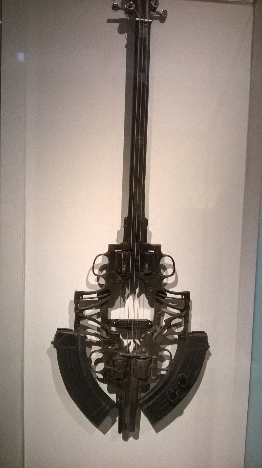
  For this week blog post, I decided to go to the museum of art and design located at Columbus circle. I went in company of one of my classmates who I planned to go with on Friday December 5th. I picked this museum from all the different choices that I had because I had passed by this museum before. I had the curiosity to see how was in the inside and the kind of artwork it had. Even though, this museum is far from my house, it was easy to get there. The admission was 12 dollars for students. Anyways, what was interesting about this museum were the different artwork that I saw. They had all kind of stuff from glass to metal. All of them were interesting and were getting my attention everywhere I was looking. I saw artworks form many artists such as Abraham Cruzvillegas from Mexico, Pepe Lopez from Venezuela, William Keyser, Pedro Reyes from Mexico and others. All of them have different ways to show their creativity with different kinds of elements. From all the artwork I saw on the different galleries they had or have in this museum, one of them that caught my attention was “Guitarra” from Pedro Reyes. Created by him in 2013. What really attracted me from this instrument was that, it was made of dangerous weapons. This instrument is a 3d form and is very symmetrical. The material used for this artwork was from some of the weapons confiscated with the purpose of making art instead of violence which takes lives from many people every day in Mexico. In general, it was a great experience I enjoyed every second of it hoping to come back again another day.


Monday, November 17, 2014

Blog post #7


Essay #2


    On the trip to Chelsea’s Galleries I had a lot of fun. It was cold I got to say but everything else was interesting. I saw different kinds of artwork from different artist. I have to say that this people do amazing works and have a great imagination to make art out of thing that for some of us are useless. From this galleries I have different thoughts and opinions. My expectations also were different from what was in my mind. Also I could see that every artist has their own way to build and create art making them unique.


      My thoughts about these galleries are that every one of them has their main attraction from all the artworks that were in each of them. Another thought is that art is not only take a piece of paper and draw anything. It has to have a meaning and also that art is not only painting but least things that we can think of are amazing works of art in this galleries. In addition, most of the artworks that I saw in this galleries are not many years old which makes the interesting seeing these artist applying their own ways to create art. Also I think that after many years this works will get more interesting and more value is going to be added to them. These artworks have all of the elements of art that we have seen in class such as line, texture, form, colors and others that make them interesting and attractive for the viewers.


    What I expected from these galleries was that the artworks that I was going to see was going to be kind of boring and none of them was going to get my attention but I was wrong. The galleries had different kinds of work one more interesting than other and better looking than others. From all the galleries that we visit, the two I found interesting in my opinion were the first one that we visit that is called “Hauser and Wirth” and the other with Asian wooden house inside. From the first one I like the large sculpture called “Moun Room”, this three dimensional sculpture was amazing. To me it look like a maze and from what I heard, it is less than a year old. The other gallery that I liked was one of the Asian galleries that we visit with the wooden house and the two big statues. What I liked from this gallery was the different colors that I saw everywhere I was looking and also the wooden house. I think it was interesting to see this kind of sculpture for the first time. Also for what I could see, it look very old but I didn’t get to know how old it was. What I found relevant of these artworks is that in my opinion most of them have that present looking. I can tell that they are not too old. From the artist the one that I felt a “spark” was Thomas Houseago” the one who created the “Moun Room” because on his creation when you look at it from the outside, it looks like something simple but once you start to get to walk around or inside it you start to see all these kind of details and shapes that give the good looking to it also because his artwork is not even a year old and from what I heard, it took him nine months to finish it.

Saturday, November 1, 2014


Midterm


The French Canadian artist David Altmedj, as I saw on the video, he has his studio in New York City. On the video I could see that different ideas on what to build. What I could see he was most interested in was “the vessel” which in my opinion was something amazing. I could notice that this artist creates 3d forms and is the way he likes. Also he says that he doesn’t do drawings because there are other materials that he finds interesting at the moment to create his work. Some of the forms that I could see he was giving to his artwork were human forms they look like menace. Other of these forms was an angel that didn’t have a face or a body but he use different parts of the human body to give that form of an angel. Other forms were the bees that he made with crystal and other material to make them look like they were alive. The process that this artist used was a process where he used step by step to finish his creation. To finish these artworks, in my opinion it was something that it seems he couldn’t finish in a day. This process may have take him a month or more in my opinion. Doing this kind of artworks it seems like mistakes are expected. I could see on the video that he made mistakes that made him start all over something that can be frustrating for anyone. The materials that I saw on the video that the artist used to make his artwork were icopor, plaster, wood, crystal, wires and other materials. What I could notice on the video is that the artists doesn’t use any kind of painting and also what I found interesting was that this artist uses part of his body to create molds for his artwork. I think that this artist artwork is a successful complete exploration of the ideas in a tangible form because his sculptures have all the requirements to be considered an artwork. This video didn’t make me think different about artist because in my opinion, every artist needs to organize their ideas before starting their artwork and make mistake when doing something is normal. This can make an artist learn and get better. What surprise me about this video was “the vessel” because the artist shows that he got a really big imagination when using different kinds of materials.  

Friday, October 31, 2014


HW #6

The drawing on the top left hand side  was found on the modern museum of art. It has no specific title but it seems like it can be called (Green Cabin). The author's name is Amy Gartrell. The medium on this drawing are ink, gel-ink pen, and pencil on colored paper. This drawing has foreground, middle ground and background. For the foreground I can say that it is the snow on the bottom of the drawing, for the middle ground I can say that the cabin is the middle ground and as the background for me is the tree. There is overlapping in this drawing, I can see clearly that the cabin is covering the tree giving depth to the drawing. This was drew on the eye level and the main object to focus is the cabin. About my drawing I can say that these are some of the house furniture. I drew them on a lower eye level. There is no overlapping but there is depth.

Tuesday, October 21, 2014

Museum Essay #1


    The trip to the Metropolitan Museum of Art was a great experience for me. This was my first time in this kind of museum since I came to this country. From other classes that I had taken, I had heard about this museum but didn't any idea of how it looked in the inside and the place where it was located. This museum has sculptures and paintings that are from many years ago which surprised me when I saw them and even more when I saw the date when they were done. In this museum, once I was inside every painting and sculpture caught my attention because of the big collection that they have but as the assignment says we were supposed to choose two paintings or two sculptures to compare them. From many options that I had, I decided to pick this to paintings right on top. The one on the left side has the title of "Madonna and Child with Saint Francis" made by Giulio Cesare Procaccini, in Italian, Bologna 1574-1625 and is an oil on canvas. The other on the right side, has the title "The Coronation of the Virgin" made by Annibale Carracci in Italian, Bologna 1560-1609 Rome also painted in oil on canvas.

     This two paintings in my opinion are good for this assignment. This two paintings have similarities that can be compared looking at them side by side. Both of this paintings have principles of design. What I notice at first, is the contrast that exist in. By describing where contrast is shown in this two paintings, I can say that the contrast that I see on the painting on the left side is between the red cloth that the lady who is carrying the child has on and the blue that one of the children that is hidden behind the man on the left side. On this painting I also see smooth shading and the different tone of shadings that is all over the painting that makes it have that realism. On this painting, another principle of design that I can notice is repetition. The person who made this painting used repetition on the shape that he used to make every person's head on this painting. About this painting I can say that the focal point is the lady and the child because is where all the people on this painting is looking at them. In addition, another principle of design is balance. On this painting there is an asymmetrical balance.

    In comparison to the painting on the left side, the painting on the right side is almost similar. Some of the similarities are the quantity of people that are in the painting. In terms of principal of design, I can tell that there is an asymmetrical balance in this painting. I say this because if I cut the painting in two halves, the amount of objects and people are the same, the shapes are different. As we see on the left side painting, this painting also has smooth shading that brings the painting to life. In both paintings, light is implied. Another similarity that the painting on the right side has is contrast. The contrast between colors is the same as the painting on the left side red and blue but in a different  place. In my opinion, what make this two paintings similar is where the viewer focus their eyes. For me on this painting my eyes were focused on the middle where the virgin is which was the same case as the painting on the left.
      

Sunday, October 12, 2014


HW #4


     For this assignment, I found this drawing from Victoria Ecclesia, Torino Medieval Castle 1884 on the Google Art Project gallery. From what I learned on the last class, I can see that this drawing is composed of many lines and shapes that gives the realism of this drawing. The author of this drawing in my opinion, seems to use more of the smooth shading technique than the cross hatching. For the strong light implied in this drawing, I can see different tones of shadings. Some examples are the shadows on top of the bed that has a very dark tone than any other parts of the bed because light doesn't hit those spots directly. Besides shading, I can see that the author used different kinds of lines to make this drawing come to life. I can also see some repetition of the same shape on the top. For me the focal point of this drawing goes directly to the bed than any other object. I'm telling this because the bed seems to have more details.

Wednesday, October 1, 2014

hw # 3


        This colorful drawing from Erik Parker and whose title is "Forces of Nature" I found it on the museum of modern art. This drawing has principles of design; one of them is balance. even though there is not a line to divide this drawing to see a clear balance, the balance that we can see is in the colors. In this drawing we also can see contrast between colors. Some of the contrast that we can see in this drawing are red and green. The background of this drawing, shows pattern with the different designs that we can see that are repetitive. On the yellow shape that surrounds what it looks like two guys and other objects, we can see also pattern on the edges. The background of this drawing is mostly blue but with different tones the same with the green color that makes the drawing have a kind of rhythm.
hw #2


     Everywhere we go, we can see art. This kind of arts can be paintings, drawings and sculptures that for sure we consider art but if we can take a moment and look around us we can see art. The picture above I considered an art accident. This old abandoned bicycle I found it on one of Manhattan's streets. This a 3d art because you can touch it and walk around it. Also if you can see, there are shapes such as circles and triangles.  There is not a big variety of colors but the time this bicycle has been there makes it look unique as if someone just try to make art out of it because they have the idea to make art.

Wednesday, September 10, 2014

  HW #1


                  Around the world there are different kinds of art work. Some of them are shapes, paintings or objects that have a valuable meaning for those who create them. In some art works, by just seeing the colors or the way that the art work has been painted, we can also see the kind of emotion that the artist tryst to describe. The painting above is located in my house's living room, as you can see is in 2D. In this image I can see an eagle that looks like is trying to hunt. In terms of art I can see that the artist is showing his love for mother nature or his loves towards this kind of animals. Also by just seeing this eagle, the sky and the mountains behind, in my opinion this image reflects a feeling of freedom.